Web / transparent video website
How to add transparent video to a website
Use transparent WebM in HTML without wrecking page speed: markup, positioning, accessibility, fallbacks, and practical performance checks.

The useful answer
Ship a short, tightly cropped transparent WebM, reserve its layout space, respect reduced-motion and data constraints, and provide a fallback for browsers that do not render the alpha channel.
Remove a video backgroundDecision map
From source clip to useful output
Define the destination
Decide where “transparent video website” must work before choosing a format or background.
Protect the moving edge
Review hair, hands, motion blur, and every place the subject crosses another object.
Test the real delivery
Open the result in the actual browser, editor, presentation, or social workflow.
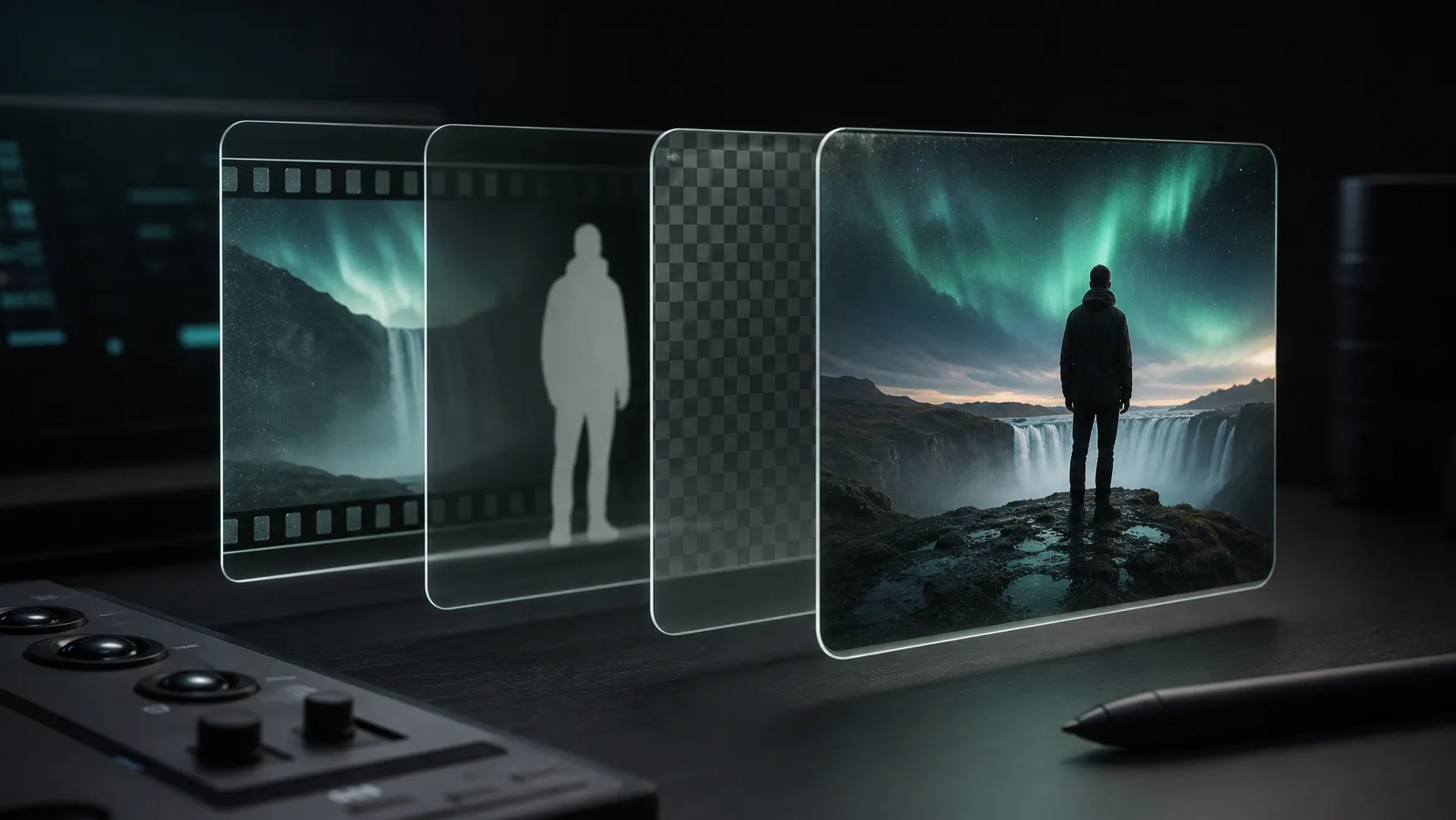
Transparent video lets motion sit inside the interface instead of inside a rectangle. A presenter can point at product controls, a rotating object can float above a gradient, and an animation can cross section boundaries without carrying its original background.
The effect is easy to overuse. Transparent video still has download, decoding, accessibility, and browser-compatibility costs. The best implementations are short, purposeful, and designed to fail gracefully.
The basic HTML
<video
  class="presenter"
  autoplay
  muted
  loop
  playsinline
  preload="metadata"
  poster="/presenter-poster.webp"
  aria-label="Presenter demonstrating the editor"
>
  <source src="/presenter-alpha.webm" type="video/webm" />
</video>
Muted is important because browsers commonly block autoplay with sound. Playsinline prevents mobile playback from automatically taking over the screen. A poster gives the browser something useful to show before the first frame is ready. If the movement is purely decorative, use an empty alt equivalent by setting aria-hidden instead of writing a label that adds no information.
Position it without breaking the layout
.presenter-wrap {
  position: relative;
  aspect-ratio: 4 / 5;
  overflow: clip;
}

.presenter {
  position: absolute;
  inset: 0;
  width: 100%;
  height: 100%;
  object-fit: contain;
  object-position: bottom center;
}
Reserve the final aspect ratio so the page does not jump when video metadata arrives. Use object-fit contain when the full cut-out must remain visible. Use cover only when cropping feet, hands, or hair is acceptable. If the video overlaps text, verify contrast on every frame rather than only on the poster.
Plan for alpha compatibility
A browser can play a WebM and still fail to display its transparency correctly. MDN documents alpha support for VP8 and VP9 while noting a Safari limitation. Because capability detection for alpha rendering is not as simple as checking the file extension, use progressive enhancement: make the page complete without the video, then add the transparent layer where you have tested it.
- 01
Design the static state
Start with a poster image or a composition that works with no presenter at all.
- 02
Add the WebM layer
Load the transparent video for the browsers and devices in your support matrix.
- 03
Provide an opaque fallback when needed
For a must-see demonstration, render the intended background into an MP4 and serve it as a separate experience.
- 04
Test on real Safari and mobile devices
Do not assume that successful desktop Chromium playback proves cross-browser alpha support.
Make the file smaller before changing code
The most effective performance work happens in the edit. Trim dead air, crop empty transparent pixels, lower the resolution to the largest rendered size, and choose a sensible frame rate. A waist-up presenter displayed 360 pixels wide does not need a full 4K canvas.
- Keep loops short and make the last frame flow into the first so the file does not need extra padding.
- Crop the canvas close to the moving subject. Transparent pixels still contribute to frame dimensions and decoding work.
- Avoid loading several alpha videos above the fold. Each one competes for bandwidth and decoder time.
- Use preload=metadata or preload=none unless the video is central to the first screen.
- Measure on a mid-range phone and a slower connection, not only on a developer laptop.
Load it when it becomes useful
A presenter near the bottom of a long page does not need to download during the hero. You can defer assigning the source until the video is close to the viewport. Keep the poster and fixed aspect ratio in place so the lazy-loaded version does not create layout shift.
Respect motion and data preferences
If the operating system requests reduced motion, pause the autoplaying layer and show the poster. Give an essential explainer visible controls and captions. For purely decorative movement, keep it out of the accessibility tree and make sure no meaning disappears when it stops.
@media (prefers-reduced-motion: reduce) {
  .presenter {
    display: none;
  }

  .presenter-poster {
    display: block;
  }
}
Launch checklist
- The page communicates its message before the video loads.
- The video has a stable width, height, or aspect ratio.
- Autoplay video is muted and plays inline.
- Essential speech has captions and user controls.
- Reduced-motion visitors get a useful static state.
- The alpha channel has been checked in every supported browser.
- The file is cropped and encoded for its actual display size.
- Mobile page weight and responsiveness have been measured on a real device.
Sources and further reading
Quality gate
Three surfaces reveal different edge problems
Light background
Look for dark contamination, clipped hair, and hard matte boundaries.
Dark background
Look for pale halos, spill, and semitransparent noise around motion.
Final destination
Confirm playback, dimensions, compression, and transparency where viewers will see it.
Try it on a difficult ten seconds
Upload a clip with hair movement and a hand gesture. Backdrop gives you the first 60 seconds free, so you can judge the cut-out before committing the full video.
Remove a video background